Hello- this is the second week of this blog and as you can see it's been changing with every post. I do apologize for the confusion about what this blog is actually about. After years of hesitating to start one of these I just jumped right in and started throwing ideas around. If you are a creator of any kind you may know that the initial energy that one brings to a new project never lasts. After all, it really is a lot of work. Of course, it is fun and rewarding in the end (that's why I do it!). So, if you've been with me for the past 3 Fridays then you may be asking yourself, "What the heck is going on here?". I assure you that I have finally settled down my brain (it finally stopped churning out a million ideas a minute) and am working diligently on a project that I mentioned last week-
99 Dreams.
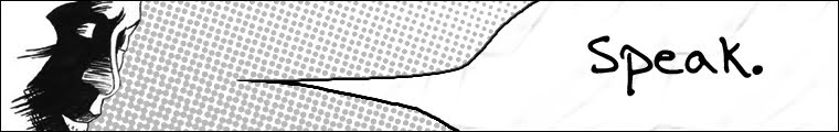
What you seen here is a promo poster that I made in the past two days. Of course, it tells you absolutely nothing about the story, but you must admit that you are a bit intrigued. Aren't you? WELL I HOPE SO!!! So, over the past week I have been writing down the synopsis for the entire story and have plans to start the script immediately afterwards. In the meantime, I documented almost the entire process of how I made this image that you see up above. Okay, here we go!
Step 1
This is the step in which I select my surface to work on (in this case an old 6"x8" piece of matte board). Note that I used a grid pattern for this. I decided to use it just to give myself a sense of the area as I began to draw out the initial sketch (I didn't use any transfer method).
Initial sketch drawn with an F lead pencil. I typically use the brand
Kimberly.
Step 2
Okay, so after doing the initial sketch I then bring in some tones. Since this is a painting I start with a non-obtrusive color for my
underpainting. Following the traditions that have been in place for over 500 years by the Renaissance I always choose an earth tone like yellow ochre.
Here's the piece after I have laid in some tones. I really like this part of the process when everything is monochromatic. Sometimes I wish that I could just stop here and be done. It really has a pleasant look.
I then grab a burnt umber and lay in some dark tones. I do all of this because it acts as a guide for when I lay in some thicker paint. Painting is not too natural for me so I have to work at it a bit more than others. You'll notice that everything has a low opacity. You want this layer to be covered easily by subsequent layers. Don't use too much pigment in this stage.
Step 3
By this point I have a good idea of how the light is playing off of the mask. Most of the gradients have been put in place any last minute adjustments have been made. This sorta looks like a
David Mack painting so far, not to compare myself to such a great artist. I've had the pleasure of meeting him once in NYC. He's a really nice guy. Okay, enough sidetracking- let's get on with this!
Above you see that I have brought out some
Gouache paints. I really love Gouache- it's got a nice consistency and it goes very well with watercolor. I like to feel like I'm actually painting when I used water-based media so Gouache works well for me. Since it's a much thicker paint than watercolor it requires a bit more water. Also, when it dries it has a matte finish (sometimes I like to draw on top of it, once it's dried, with a heavy pastel). If you've never used it, I highly recommend experimenting with it.
For the purposes of this painting here are some of the colors that I'll be using.
I usually grab a number 2 or three round brush and a flat shader when I paint with Gouache. As you can see it's getting much more opaque. The burnt Sienna (in the dark areas) has a very rich and earthy tone to it. The orange is just the right tone for what I'm looking for. I chose these colors because they have a nice harmony to them. This painting was done with a digital finish in mind.
Step 4
After the darker Gouache has been laid in I think it's about time to tighten up the edges and add some highlights. This is the tricky part because you have to remember that you're making a painting and not a drawing. I try not to outline too much in this part of the process.
Because this is going to a digital step I really don't get to finicky here. It's just important to delineate the form like I said before. You'll notice that not much changes in this step.
Step 6
Now for the digital process I use Photoshop. The main goal is to just get an oil painting look without actually doing one. Over the past month, when I was at the NYC Comic Con, Jake and I had the pleasure of meeting
Brian Haberlin. This guy pretty much revealed to me a whole side of digital coloring that I just never understood. He sees the never-ending possibilities of digital media and embraces them while others choose to do the status quo (mostly due to tight deadlines). A trick that he showed me was how to use the
Art History Brush. This brush will literally destroy your image only to rebuild it using any style brush that you want, giving you an endless array of effects. I will not go into the entire process here. Just check out the link that I provided and you'll know the general idea behind it.

Take a look at the tones here that I am able to get with this tool. You'll notice how it now has a painterly feel to the soft edges. I want to let you know that this process, although it is automated, still requires a good deal of attention and detail. Some people believe that the computer is supposed to render everything perfectly with the click of a button. For this approach I recommend using a tablet and stylus (I use a Wacom bamboo and it's fine for my purposes). I have made multiple copies of layers and overlaid them with various layer effects. Also, I'd like to note that I used a Sony 12 mega pixels camera to get the painting on screen.
And so, you've already seen the finished product, but here it is again. This has been a very in depth post. I hope to have something else for you all next week. Take care for now!