Friday, December 17, 2010

In the Works!

Hi All!
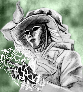
         I've been keeping busy since my last post with work and personal projects. I'm trying to keep my skills as an illustrator sharp while pursuing digital techniques. As a result, I've got some pencil illustrations to show you. The first one is a take on a photo that I came across while at work. The original photo shows a couple embracing in a moment of happiness. I thought, "Hmmmm....that looks pleasant. What happens when I put a mask on the guy? Does that change the composition? You be the judge." I'm pleased with the drawing- definitely my smoothest pencils to date. I used Canson Illustration paper (11"x17") and an F lead pencil.


The second illustration is something that I started last night, after work, and I stayed up until 1am working on it. It's a pin-up for the comic Skullkickers by writer Jim Zubkavich artist Edwin Huang. They're going to be in Woburn for a comic show and I want to stop by their booth and show them some love. Apparently, Skullkickers is the biggest thing in comics. It's sold out everywhere, and I haven't even gotten a chance to read it, aside from this preview! Check it out- I think that you'll enjoy it.

That's it for me. I'm looking forward to finishing up these illustrations. I'm just having a hell of a time getting them up on screen since I don't have a large format scanner. :(

Thursday, December 9, 2010

It's All in the Face- Digital Painting Session: 2

Hi All,
    This week is my second experiment in the realm of digital painting. It's been exciting to really dive into different methods of painting in Photoshop. It's so easy to let the computer restrict you because it's not as intuitive as holding a brush. Because of this I always felt that there was a wall separating me from getting at what I was really trying to do. A few tutorials later and the wall is beginning to crumble, and I'm finding my own process starting to emerge. It's really about being comfortable.
    For this recent painting I felt that it was time to try my best to mimic oils. I've always been more of a portrait artist so naturally I wanted my first subject to be a portrait. The human face is a familiar subject, yet it is one of the greatest challenges for an artist. One has to worry about being accurate and to create a relaxed, natural composition at the same time. For this challenge I chose Howling Bells front-woman, Juanita Stein, as my subject. I love the Howling Bells and the way in which Juanita embodies the soul of the band. Plus, she's Australian, and she's...well....cute!

Here's the entire process, documented one snapshot at a time.


Starting out with barebones lines on a white background.

See that I've now gone under Image/Adjustments/Levels
and bumped up the gray. It's still an RGB file- I just prefer to work in
grayscale since I trained myself to work this way from a young age.

A little bit of dodging and burning and we start to see the
beginnings of a face take shape. Still a long way to go...

I've sorta come as close as I can at this point with a light gray. 
Time to bump up the darks a bit more.

Remember to make copies of layers and to save different versions of the file.
I ended up with 4-5 versions of this file at different stages of the process.

Bumped up the black a bit more. This helps to carve out the light more.
There were parts of the face that didn't look right to me, according to the photo (nose is too long, face too slender) so I moved things around a bit in the next step.

Here I am in the Liquify filter, moving around facial features without any problems (I love that about digital painting!). She's starting to look more like Juanita. 

So, as you can see, the form is really there and I've gone pretty far with the grayscale.
For my purposes this was enough, since I wasn't doing a grayscale piece. If I were then I would have had to get more finicky with the smudge tool. Let's make some selections and add some color!

Close up before color.

I used the QuickMask (command + Q) feature to make my selections. I lowered 
the red opacity so that I could see underneath what I was selecting. Make sure to use 
a hard edge brush with opacity set at 100% when you do this or you'll get weird gradients
in your selections that will show when you fill them with color. 

In QuickMask Mode- the red represents the selected area

Always save your selections. I've never found a reason not to hold 
onto even the smallest selection. Why do the work twice? Oh, and give them names that
 make sense- otherwise-you may not know what some of them are.

Got her face and neck selected- time to add some color by adjusting the Hue/Saturation.
I try not to screen or overlay colors- that just gets complicated. 

Trying to match her skin tone roughly. Not gonna get it quite right at this junction.
Best to just get the general color in there and adjust it later. The important thing is to
keep moving with the piece. Digital painting gives the artist the ability to work as much
as they want to without the fear of overworking the surface. You're basically 
encouraged to play as long as you'd like!

Sometimes you just have to add color in the background to get the piece
moving. I got to a point after smudging around tones for hours, where things just
plateaued. Don't forget about the background- it's integral to the composition. It
can make or break a piece. I started to make textures and dump them in there.

More experiments with the background- trying to overlay textures.

This background was really nice- but it didn't fit with the subject. Also,
I wanted to elevate it a bit by using the Art History brush.


And after some major tweaks this is the final piece. 
I really do hope that you enjoyed this post as much as I enjoyed making 
this portrait. If you think that this post was helpful, or that you'd want to talk
shop a bit- please do drop me a line. Farewell, for now, and listen to
the Howling Bells. THEY'RE REALLY REALLY GOOD.


Wednesday, December 1, 2010

Digital Painting- I told you that there'd be masks!

Hi All,
          First of all, I hope that you are doing well this week. Secondly, I would like to thank all of you for helping me to get this blog to almost 300 views in fewer than two months! I couldn't be more pleased with the positive energy that I'm getting. Keep it coming and I promise to update every week.
          Lately, I've been doing a lot of drawings and not taking them up to the next level. The following is a tutorial of how I took a drawing from Thanksgiving and brought it through to a finished digital painting over the past 2 days. This is just a taste of what I've got in store now that I've recovered from being sick and I've had time to watch Brian Harberlin's tutorials. I hope that you enjoy it!
Step 1
So, by now you know that I'm obsessed with Venetian masks at the moment. That's the main reason for why I chose this as my subject. The first stage is a simple pencil drawing done on Strathmore drawing paper. Here we see that I've added some background effects into the piece in photoshop.

This is a snapshot of another window that I had open where I experimented with making smoky effects by varying brush styles.

I recommend playing around with 'Scattering' & trying out 'Texture' to
 see what works for you.


Step 2

Okay, so at this point I'm trying to add in highlights and position everything for when I start to paint. I wanted this to have a cool glow effect as well, so I found out how to take a brush and convert it into glowing energy.

This is a weird shape that I made and later cut out and used for the glowing energy that you see below.

I took the shape and threw a Gaussian blur (Filter/Blur/Gaussian Blur) on it and warped it under Edit/Transform/Warp. I then highlighted it with an airbrush and did Hue/Saturation adjustments to it. After that I flattened the image and started working on top of it.

Step 3
Next, it comes time to add colors. I didn't have a color scheme in mind so I started with any ol' colors really. The point here is to just carve out the clothes and face. The colors can change instantly. Keep in mind that I have a selection of the actual figure and I can make adjustments to the color by selecting it and using Hue/Saturation.

With the selection on. Darn marching ants! Quick tip: command + H will hide them.

Step 4
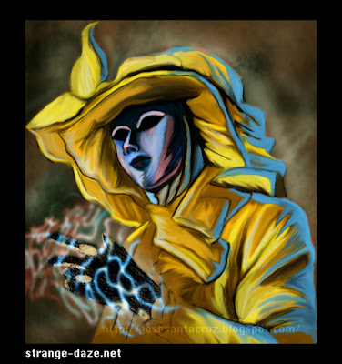
Here is what I came up with after adjusting the colors. I use pink and purple to often in my work so I wanted to break out of that. Yellow is also a challenging color to use because it is so harsh on the eyes if not used properly.

This is what it looks like with the line art layer turned off in PS. Kinda crappy, huh?

With some tweaking you can see that the figure is getting more volume with the addition of some backlight. This is really my first time successfully using backlighting- it can make or break a piece. In this case, I think that it works nicely.

Step 5


Here is the final product, after about an hour of smudging it up with the 'smudge tool'. I like to work with the strength at about 50-60, because 100 is just too strong.


I hope that you found this enjoyable. It really was a fun piece to work on. If you'd like to see more work like this in the future please leave a comment and let me know. Right now I'm working on an 11"x17" painting from last week's post. I'll have my progress from that up soon. Thanks for checking out my blog! Until next week....farewell!