
First of all, I hope that you are doing well this week. Secondly, I would like to thank all of you for helping me to get this blog to almost 300 views in fewer than two months! I couldn't be more pleased with the positive energy that I'm getting. Keep it coming and I promise to update every week.
Lately, I've been doing a lot of drawings and not taking them up to the next level. The following is a tutorial of how I took a drawing from Thanksgiving and brought it through to a finished digital painting over the past 2 days. This is just a taste of what I've got in store now that I've recovered from being sick and I've had time to watch Brian Harberlin's tutorials. I hope that you enjoy it!
Step 1

So, by now you know that I'm obsessed with Venetian masks at the moment. That's the main reason for why I chose this as my subject. The first stage is a simple pencil drawing done on Strathmore drawing paper. Here we see that I've added some background effects into the piece in photoshop.

This is a snapshot of another window that I had open where I experimented with making smoky effects by varying brush styles.

I recommend playing around with 'Scattering' & trying out 'Texture' to
see what works for you.
see what works for you.

Step 2

Okay, so at this point I'm trying to add in highlights and position everything for when I start to paint. I wanted this to have a cool glow effect as well, so I found out how to take a brush and convert it into glowing energy.

This is a weird shape that I made and later cut out and used for the glowing energy that you see below.

I took the shape and threw a Gaussian blur (Filter/Blur/Gaussian Blur) on it and warped it under Edit/Transform/Warp. I then highlighted it with an airbrush and did Hue/Saturation adjustments to it. After that I flattened the image and started working on top of it.
Step 3

Next, it comes time to add colors. I didn't have a color scheme in mind so I started with any ol' colors really. The point here is to just carve out the clothes and face. The colors can change instantly. Keep in mind that I have a selection of the actual figure and I can make adjustments to the color by selecting it and using Hue/Saturation.

With the selection on. Darn marching ants! Quick tip: command + H will hide them.
Step 4

Here is what I came up with after adjusting the colors. I use pink and purple to often in my work so I wanted to break out of that. Yellow is also a challenging color to use because it is so harsh on the eyes if not used properly.

This is what it looks like with the line art layer turned off in PS. Kinda crappy, huh?

With some tweaking you can see that the figure is getting more volume with the addition of some backlight. This is really my first time successfully using backlighting- it can make or break a piece. In this case, I think that it works nicely.
Step 5
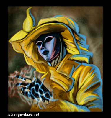
Here is the final product, after about an hour of smudging it up with the 'smudge tool'. I like to work with the strength at about 50-60, because 100 is just too strong.
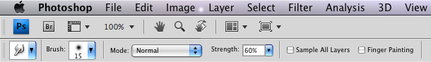


Here is the final product, after about an hour of smudging it up with the 'smudge tool'. I like to work with the strength at about 50-60, because 100 is just too strong.

I hope that you found this enjoyable. It really was a fun piece to work on. If you'd like to see more work like this in the future please leave a comment and let me know. Right now I'm working on an 11"x17" painting from last week's post. I'll have my progress from that up soon. Thanks for checking out my blog! Until next week....farewell!
PERFECTO!!!
ReplyDeleteHey, thanks brotha!
ReplyDelete