
Hello Friends,
Here we are three weeks into 2011 and I must say that the time is flying already. This post should have gone up yesterday but I was unable to find the energy to write with (actually I was too busy playing Call of Duty: Black Ops). So, I hope that you'll forgive me for not staying true to my weekly blog entries. This entry is all about a comic that I've found very interesting called, Skullkickers. I've mentioned it before, but I haven't really said too much about it. Allow me the opportunity to say a few things about it.
Skullkickers is a monthly action/ adventure comic put out by Image Comics. It's the creation of, writer Jim Zubkavich with art by Edwin Huang. This comic is extremely entertaining. Every issue is clearly defined and packed with action and humor. I like it mostly because it's a break from the world of

superheroes. The story so far follows two mercenaries as they roam a fictional landscape reminiscent of the Middle Ages in Europe. The only difference is that this land is inhabited by monsters and other strange creatures. For the first arc (I'm only two issues into it) they are looking for the killer of a Chancellor, who was mysteriously assassinated. His body is then abducted by a gang of thugs and this leads the two mercenaries on a wild goose chase. As for the third & fourth issues I'm not sure of where it's headed. I just look forward to seeing what kind of crazy situations Jim & Ed can conjure up for the duo as they travel into unknown territories.
You must be asking, "Why is he saying all of this about the Skullkickers?". Over the past month I've been working hard on a piece of my own for this comic. I've been working through new techniques that I learned from those great tutorials that I keep talking about from Digital Art Tutorials.

It even seems like Brian Haberlin has something new that he's working on with Philip Tan (Taleweaver, Batman & Robin), called Captain Wonder 3D, being put out by Image Comics. This is of course, beside the point. I won't get sidetracked any longer and I'll just show you what I've been up to!
Finished Colored Piece

I had a whole lot of fun experimenting with new techniques for this piece and drawing the Skullkickers guys was a lot of fun too! Edwin must have a blast working on these guys every month. He's very lucky. This was a three step process that I really didn't document in great detail. My advice to anyone doing this kind of work is simply this: be patient! Coloring takes twice as much time as drawing does. You have to give it time when you're coloring or it just won't do your pencils justice. For this piece, I skipped the inking process. I made a very dark photocopy of my pencils at a reduced size of 73% and scanned that in. I did this mainly because I don't have access to a large format scanner. The original piece is 11"x 17".
Step One: Pencils

I really was satisfied with the pencils that I did for this piece and that's why I skipped the inking process. I was able to get the crisp line that is common in comic art. Plus, with a little photoshopping I adjusted a few tones here and there. Inking is still essential to comics but I just didn't want to go through with that mechanical step as this was all about the colors! Yes, you inkers out there are all work and no play!
Second Step: Grayscale and Flatting

This step is really not fun at all, but necessary to the final product. The idea here is that you have to create your foundation to color on top of. Once you've created your gray tones you should keep them all on one layer. Here's a look at my layers palette so that you can see what I mean.
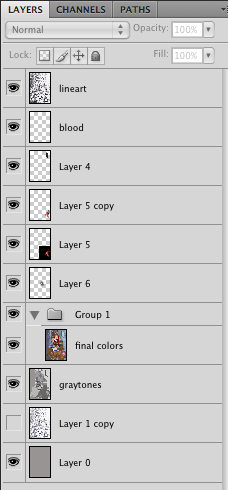
The reason for why you do this is so that you can make quick selections of your areas from the graytone layer once you've begun your coloring stage. You need to be able to select areas easily without having to constantly make new selections for the same areas. That's how comics are done.


It's really all about efficiency. In most cases, a "flatter", or a guy who lays flats, will lay in all of the graytones before the colorist goes in and starts working his/ her magic. This is mostly a practice done in the USA and some European countries. This is not the case for most Asian comics, which are mostly grayscale. Digital coloring has gotten to such a point, with the latest technology, that the possibilities of what one can do are just about limitless. The scariest part is that Photoshop hasn't changed all that much. The technology was really just waiting for people to catch up. Now we're here at this point where comics have never looked better. I'm looking forward to producing more work like this in the near future. As usual, thanks for stopping in and seeing what I'm up to! If you have any comments or questions please drop me a line. I'll check back in later this week.
Wait...more Skullkickers stuff?

Here's a picture that Jake took of me with Edwin (right of me) and Jim (far right). I got the chance to meet them when they came by Woburn for one of Larry's Saturday Comic Shows last month. They're very cool guys and I was lucky enough to buy the first two issues of the comic off of them (it sold out).



